CSS Design Awards: Best UI Design award
Art directionMotionCreative coding

Give us This Day Our Daily Lie

An immersive experience to introduce my novel and make people want to read it. Art direction, storytelling and interaction driven by scrolling.

Give Us This Day Our Daily Lie · Interactive Experience

The video follows one path. On the website, each person can find their own pace.

CONTEXT

An invitation to read, before the first page

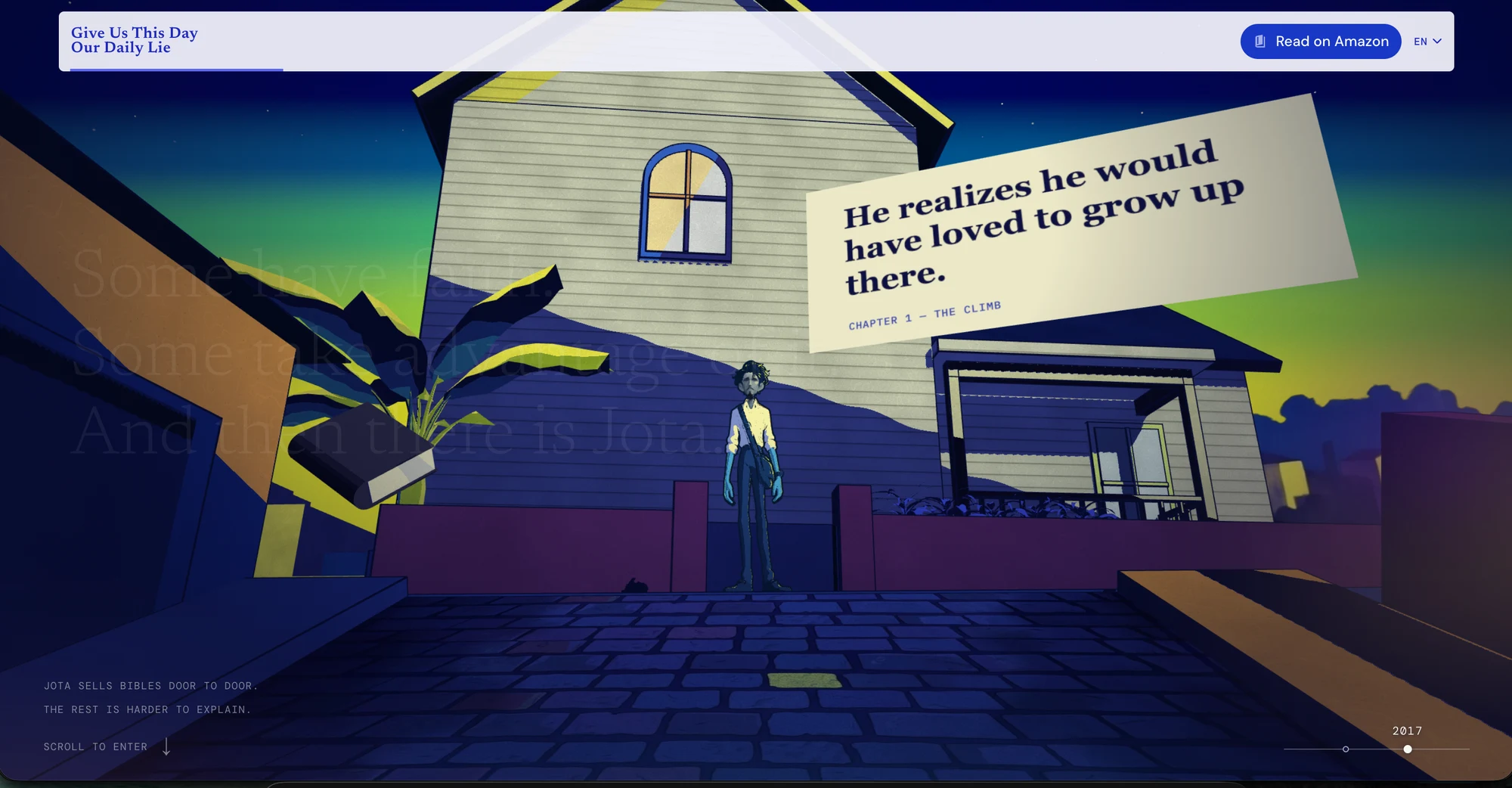
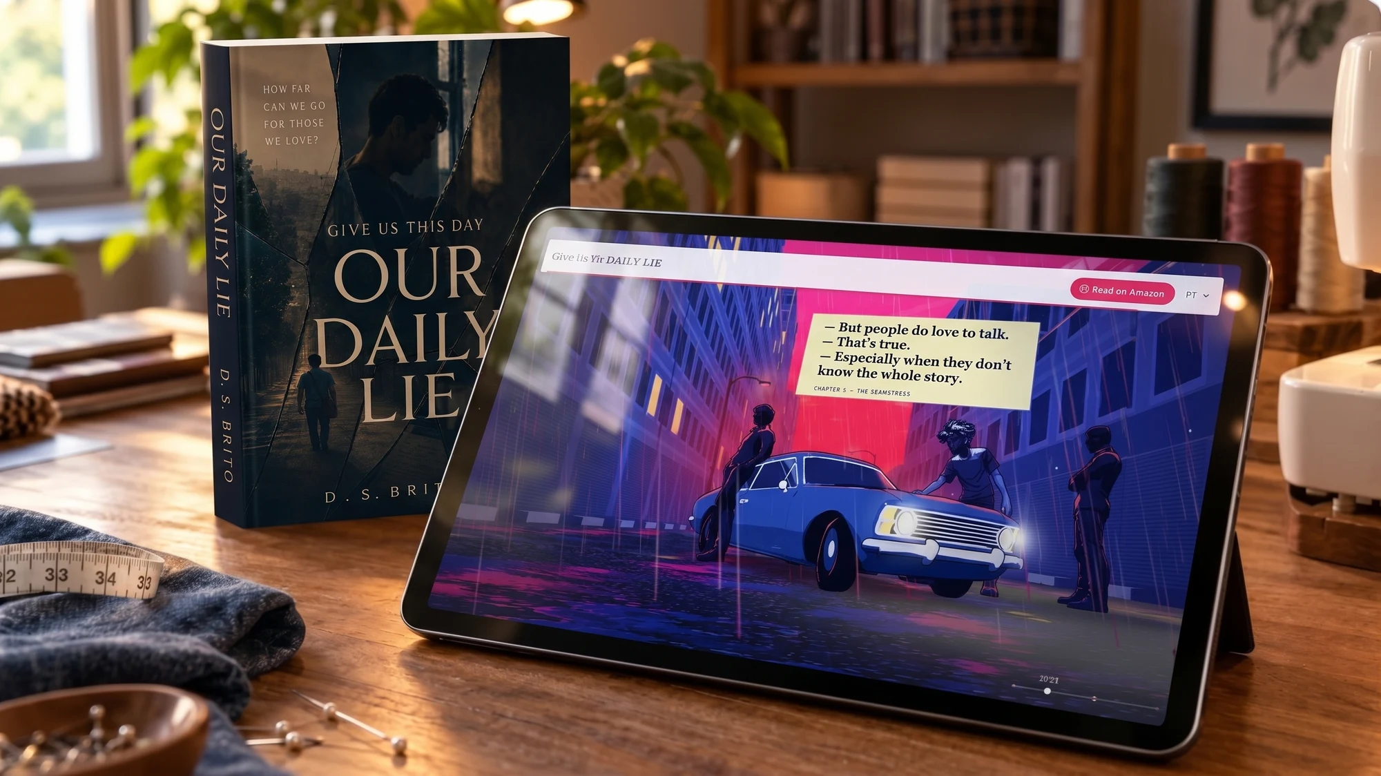
Give us This Day Our Daily Lie is a novel I wrote as a hobby. I created the website to give readers a first encounter with its atmosphere, characters and conflicts — and make them want to open the book.

I selected three key moments without revealing major spoilers. Settings, framing and transitions were designed as an invitation into the story, not a condensed retelling.

The website on a tablet beside the book on a sewing table
My roleWriting · art direction · interactionDevelopment and publishing with AI assistance
ProjectPersonal project · Web · Portuguese and English
ART DIRECTION

Finding the shape of a place that existed in words

The style came before the first prompt

I gathered references for the visual language of all three scenes and their characters before generating images. AI helped execute that direction; it did not choose it.

Scene 1 — finding the place

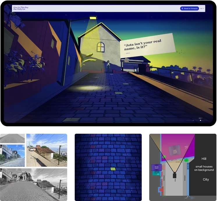
Tablet showing the website on the hillside scene — location references, texture and scale

Making-of: real location, texture and hillside study.

Geography came before the setting

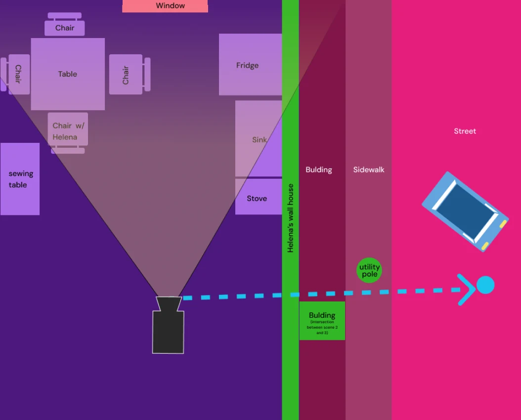
I researched a real hillside street. When words could not resolve the relationship between the street, houses and elevation, I drew volumes and side sections to guide the construction.
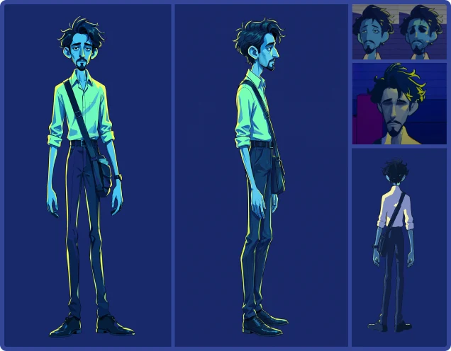
Jota character sheet and face studies

Jota needed to remain Jota

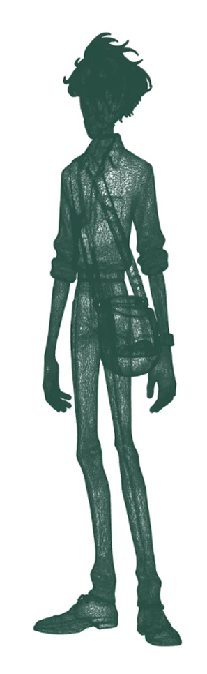
A character sheet established proportions, clothing and appearance before 3D, keeping Jota consistent throughout the process.

Presence without revealing everything

I avoided fully revealing the characters’ faces. I wanted to give them presence without closing off the image each reader can build from the book.

SPACE AND PARALLAX

Depth could also come from images

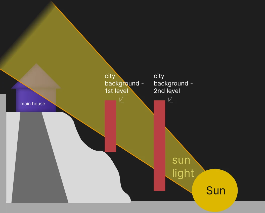
2D PLANES · CONSTRUCTION VIEW
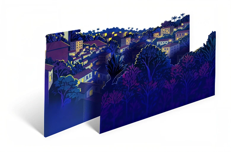
City and vegetation on two separate planes, viewed in perspective

Distant city and vegetation arranged in layers.

The street is 3D. The distant city and some vegetation are 2D planes. These layers create depth as the camera moves, with attention to each asset’s weight to keep the website light.

SCENES AND ATMOSPHERE

Light changes the place — and how we read it

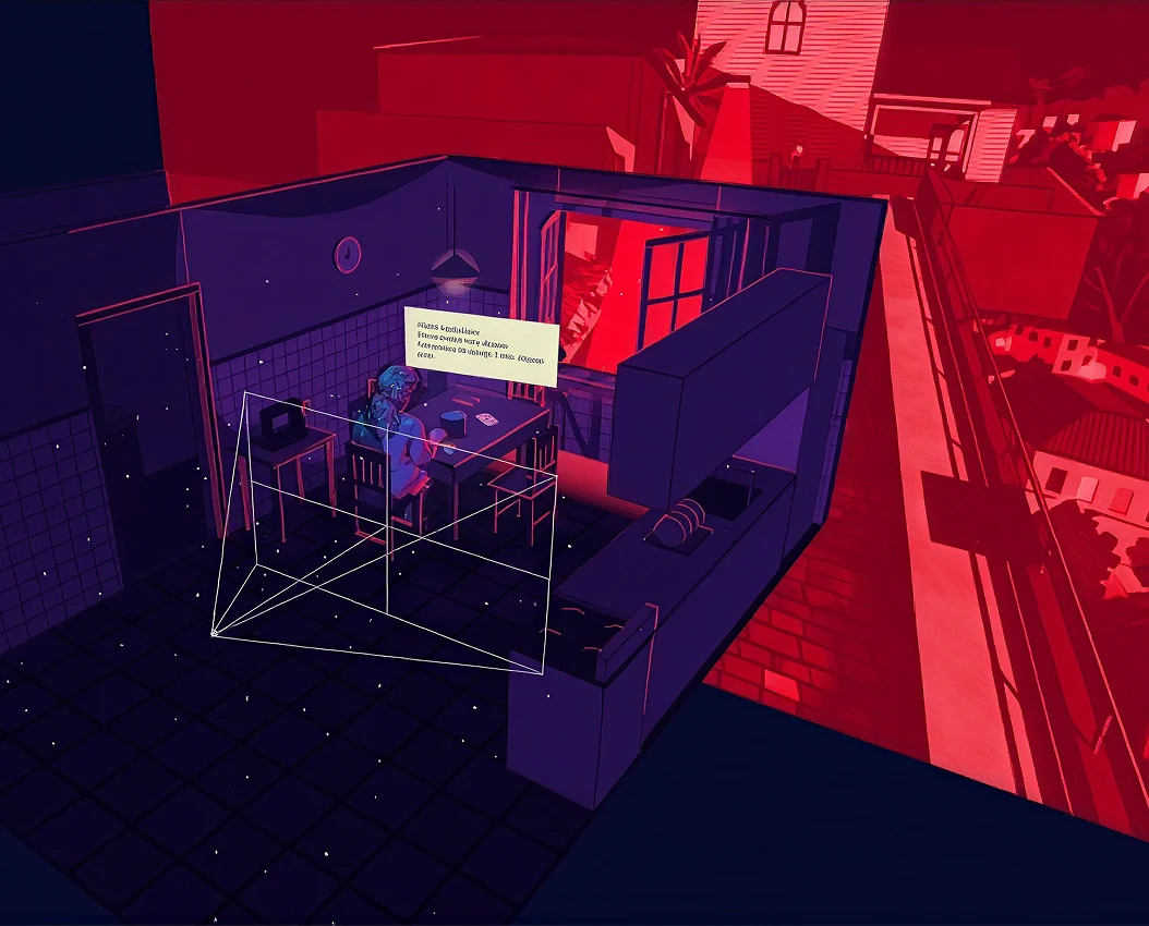
Kitchen · studies in space and light

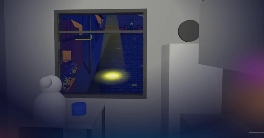
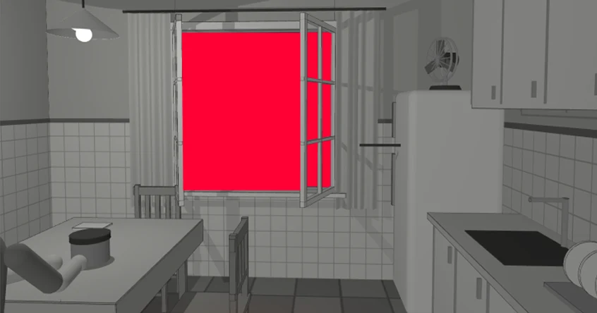
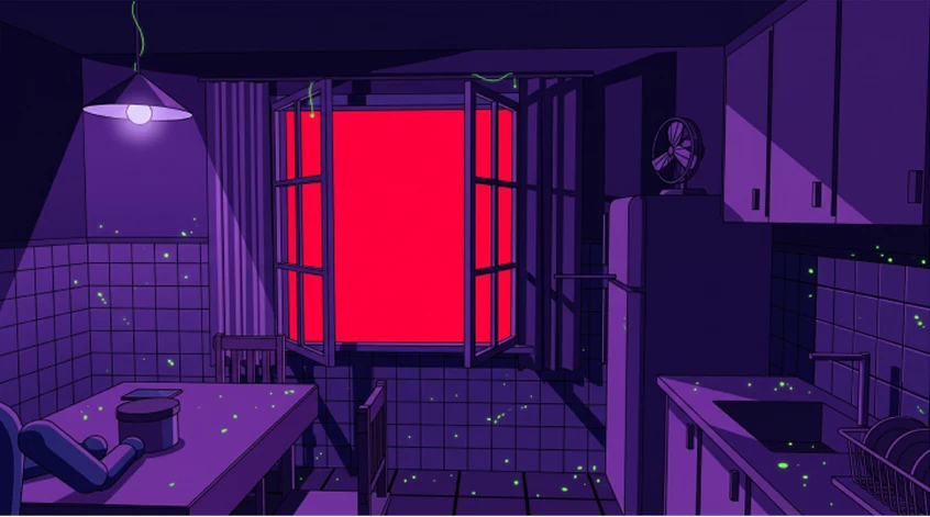
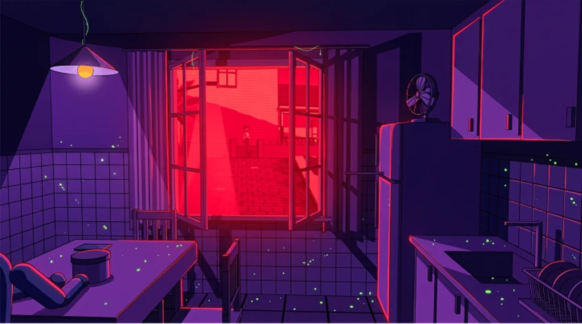
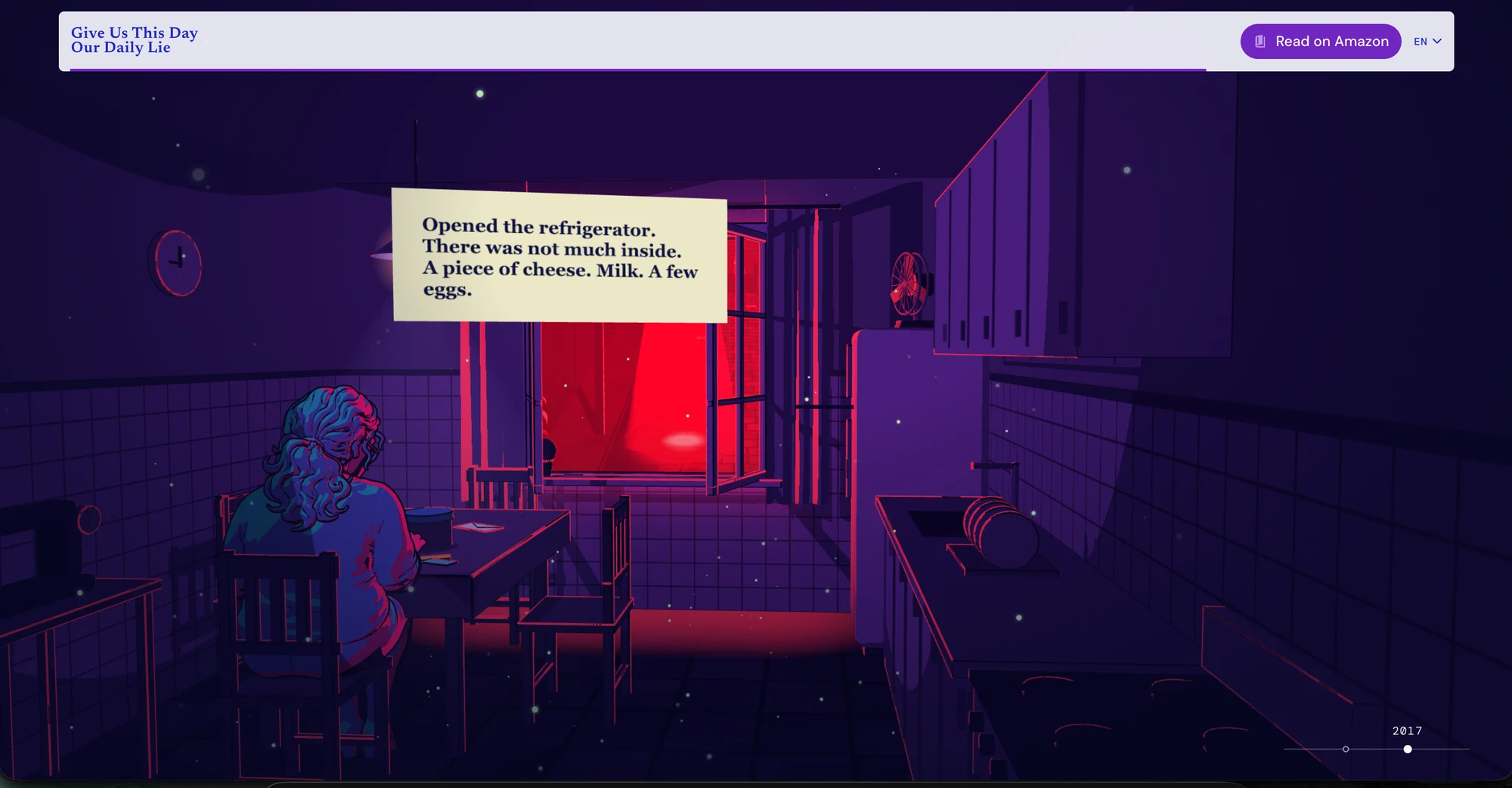
In the studies below, I worked on volume, light, the window and masking. Grayscale versions helped resolve the space; color and red light defined its atmosphere.

VOLUME AND EXTERNAL LIGHT
KITCHEN IN GRAY
KITCHEN IN GRAY
COLOR AND LIGHTING
COLOR AND LIGHTING
STREET THROUGH THE WINDOW

PUBLISHED SCENE · KITCHEN

Kitchen · studies in space and light

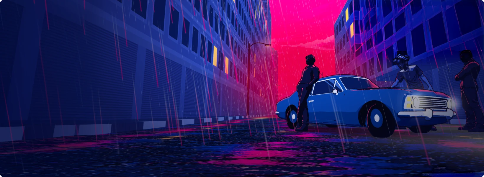
Opala · references and composition

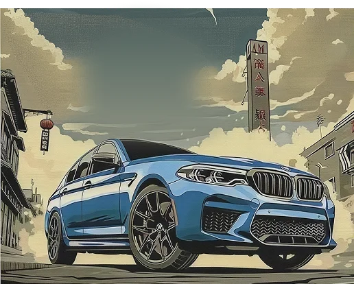
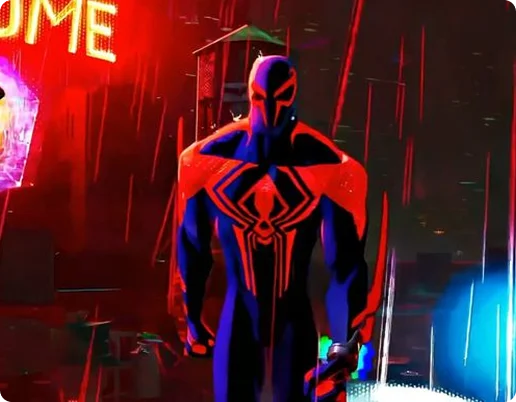
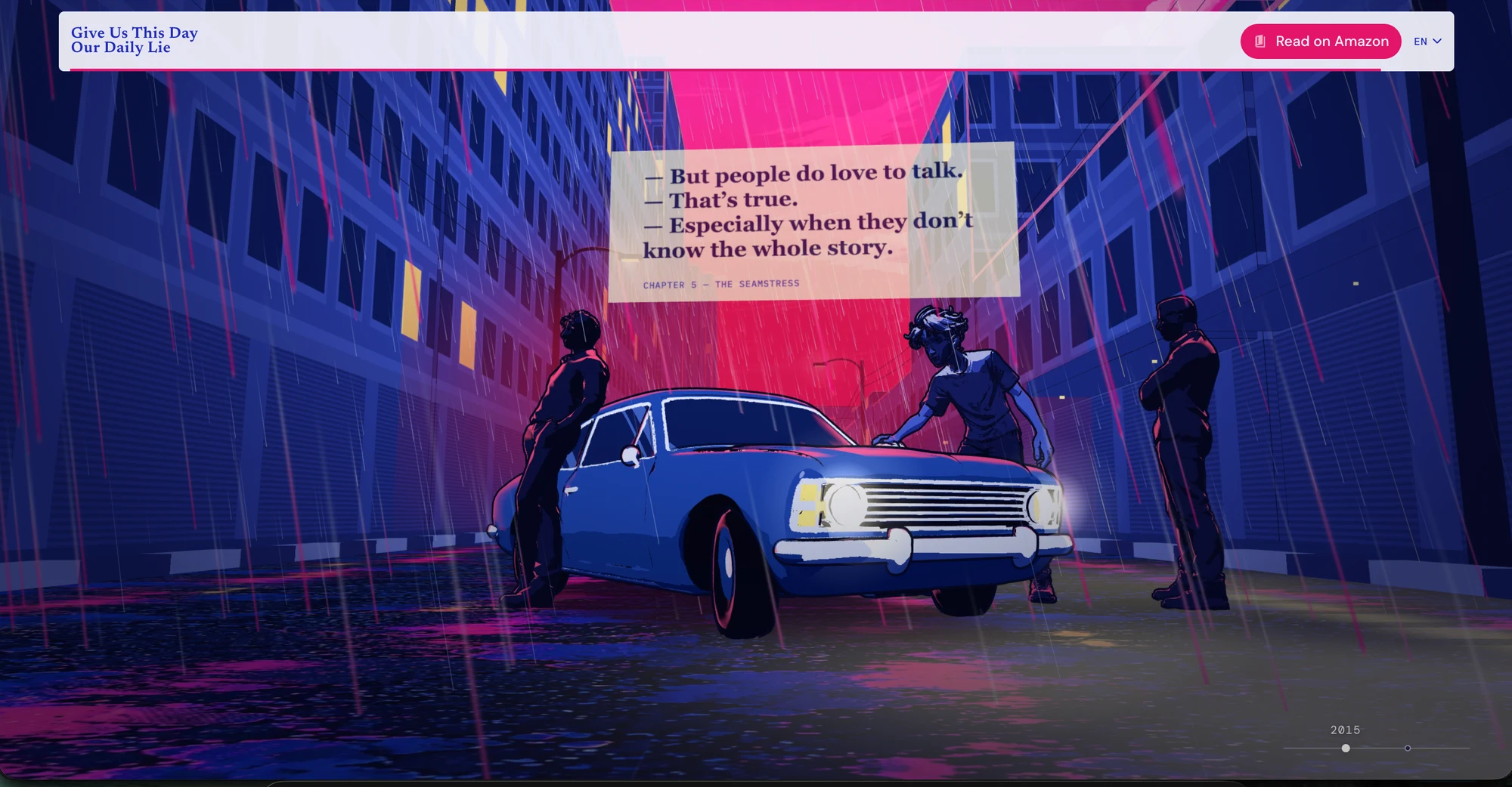
The references below explore color, rain and framing. A low viewpoint, reflections and the distance between characters helped build tension in the scene.

Benchmark · color, perspective and rain

COLOR
COLOR
PERSPECTIVE
PERSPECTIVE
RAIN
RAIN
MOTION AND INTERACTION

Moving back on screen to move through time

The retreating camera echoes the novel’s narrative, which moves forward and backward in time. Each scene presents a key moment without giving away its major revelations.

RETREAT DOWN THE HILL
PASS THROUGH THE WINDOW
ARRIVE AT THE OPALA

Between the kitchen and the Opala, a wall fills the frame before revealing the next street. The change from 2017 to 2015 turns a visual transition into a clue about the structure of the story.

FROM DESIGN TO CODE

Keep the visual. Reduce the weight.

I led the project from design to publication, with AI assistance. The technical challenge was preserving the visual quality of a 3D experience without making the website heavy.

Geometry where it matters

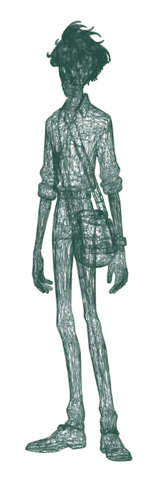
I simplified character geometry while preserving detail in priority areas. The Jota model used on the website has 91.8% fewer triangles than the original.

From a 3D street to an image

Upon entering the kitchen, the street seen through the window switches from 3D to a static image matched to the same framing. This reduces rendering cost without breaking visual continuity.

Images sized for each screen

I used responsive images with srcset so smaller screens load lighter versions instead of the larger files intended for desktop.

Optimize what the camera does not reveal. Preserve what the reader perceives.

FIGMA · GEMINI · MESHY · CLAUDE CODE · CODEX · VERCEL

OUTCOME

From atmosphere to an invitation to read

Published in Portuguese and English, with three connected scenes, framing adapted for desktop and mobile, and access to the book on Amazon.

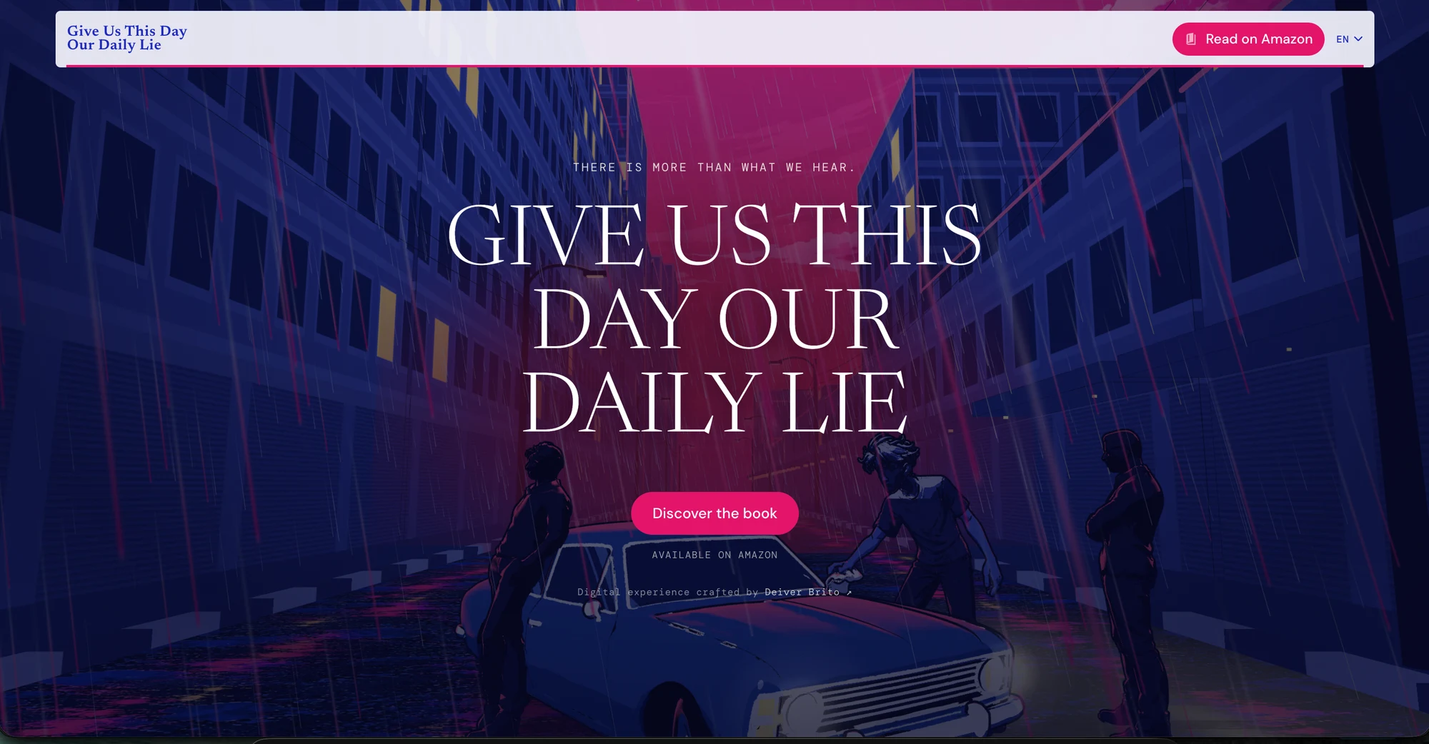
The experience ends with the book in focus and a direct path to Amazon, connecting the curiosity built across the scenes to the possibility of starting to read.

Explore the website
Website closing with an invitation to discover the book
REFLECTION

The story begins before the first page

For me, the first barrier is making a reader want to begin. Opening a book takes time and trust in a story we do not yet know — and many titles are never even considered.

Make people want to open the book — without telling the story for them.

The website was created to build that first connection: offering atmosphere, encounters and questions before reading. It does not replace the reader’s imagination; it opens a door to it.

Let’s build better digital products.

Email me