
SCRIOO
Supply chain risk, for teams who are legally accountable for it. I redesigned how the platform shows risk — what the map says first, and what waits until you ask.
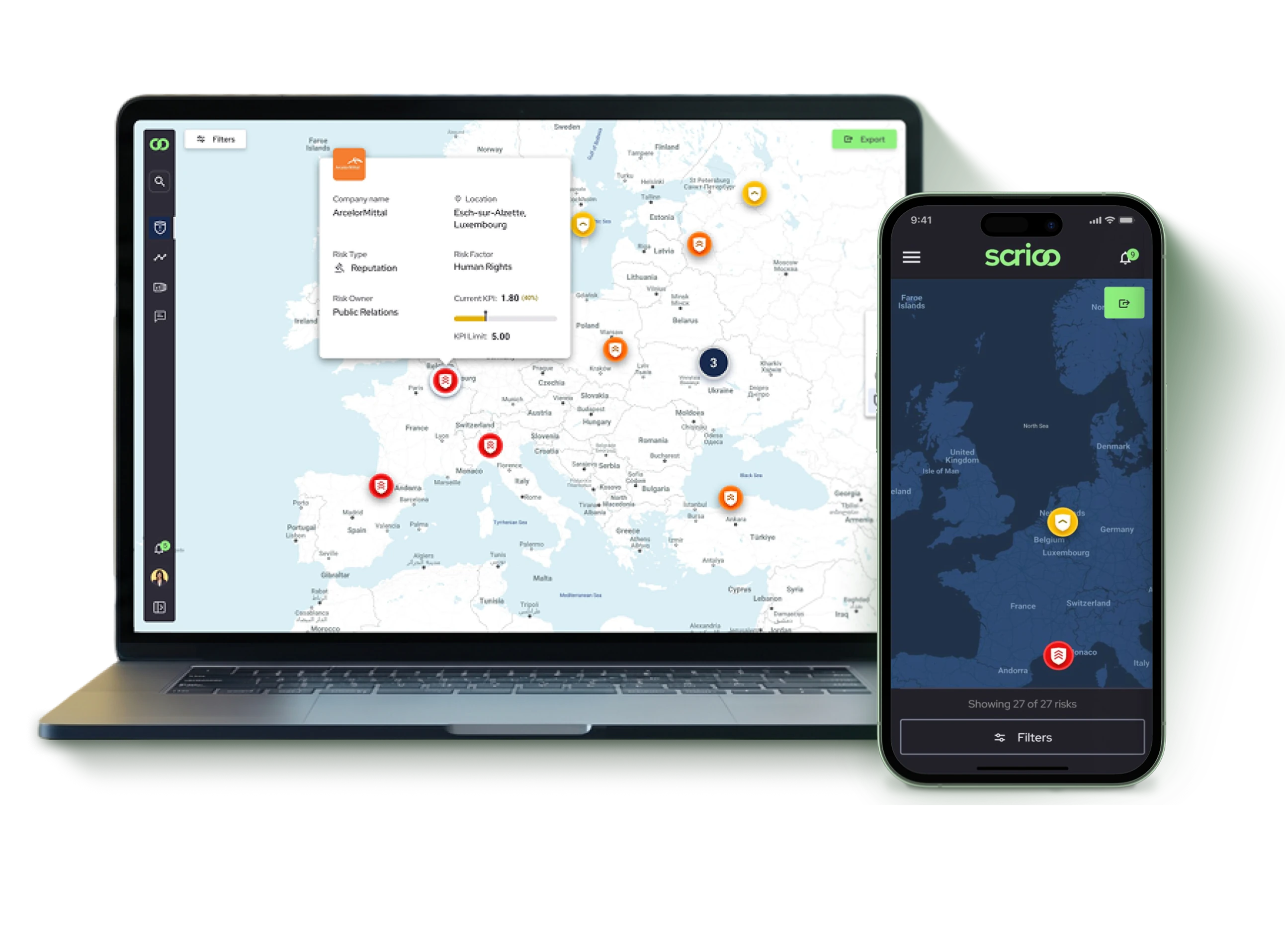
Everything Competed for the First Layer
SCRIOO is a supply chain risk platform used by procurement, business development and sustainability teams. Its users are companies subject to the European Supply Chain Due Diligence Act — which makes them accountable for human rights and environmental risk inside their own supply chains.
The platform monitors 180 million sources across 60 risk categories. All of it had to reach one map without the first glance becoming unreadable.
We also had no direct access to the people who would use it.
 My Role

 Collaboration
Deciding What the Map Says First
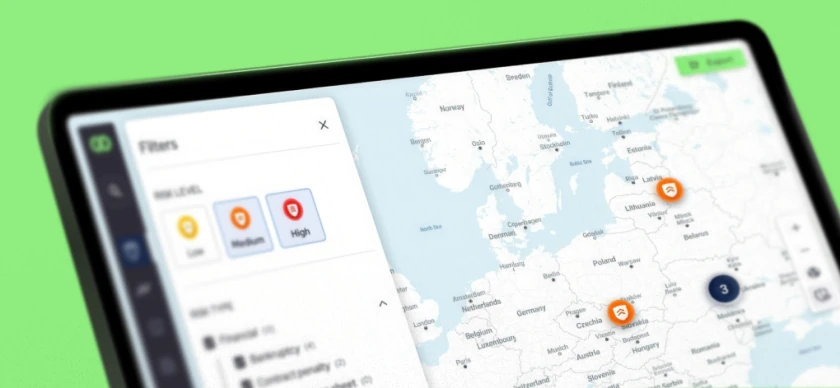
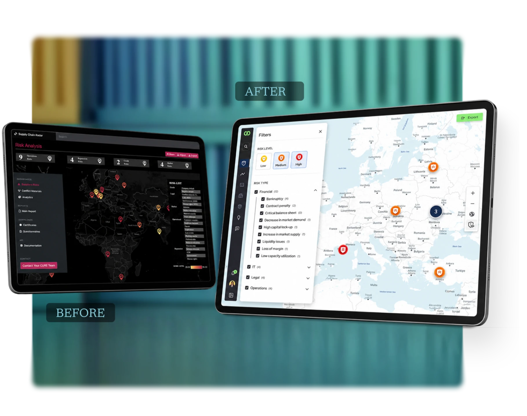
Problem: The risk map showed many markers at once, and each one tried to say several things at the same time.
Proposal: Simplify the markers so the first layer shows the most important risk signal first, with detail available progressively. Severity uses color plus a second cue, never color alone.
Argument: The map's main job was to direct attention. Showing less up front led to faster decisions.
Validating Clarity Without Access to the People Who Would Use It
I ran focused tests with external participants. The goal was never to validate domain expertise. They had none. It was to check whether someone seeing the interface for the first time could find the structure, follow the main flows and complete specific tasks. We tested only the areas where the team was most uncertain.

Map Scanning
QuestionCould people identify the most important risks on a dense map?
TestMultiple risk markers in a simplified scenario.
What changedSimpler marker hierarchy and clearer severity cues.

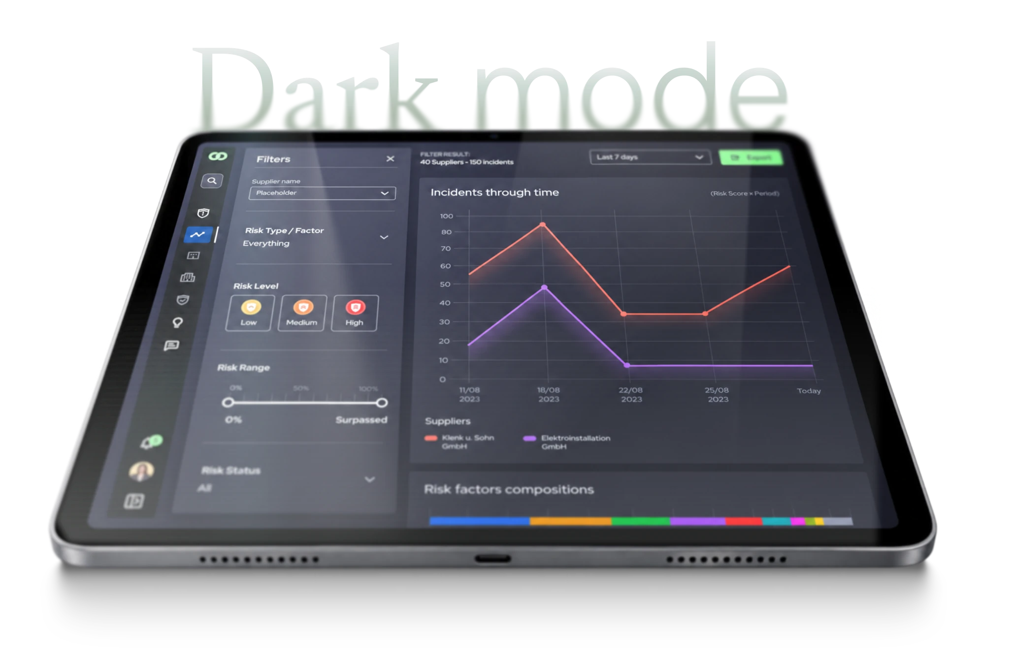
Supplier Comparison
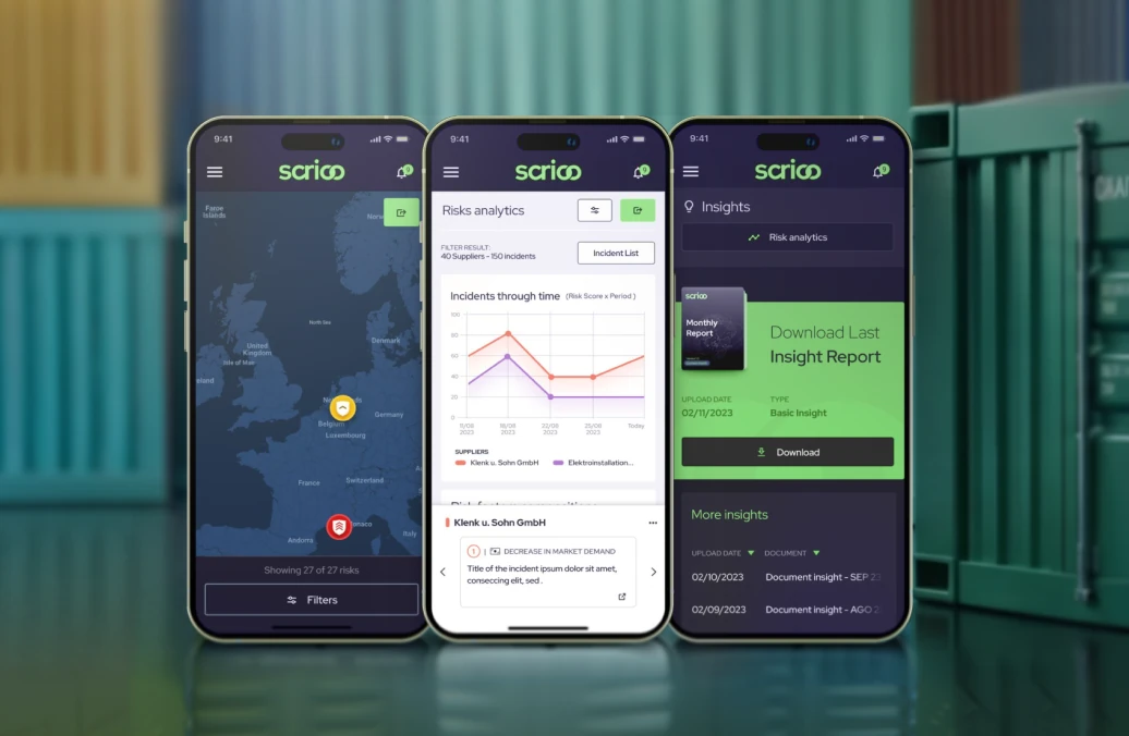
QuestionCould people compare supplier incidents over time?
TestIncident Through Time with two or more suppliers.
What changedChart hierarchy, labels, and comparison flow.

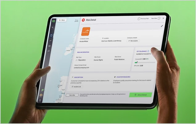
Progressive Detail
QuestionCould people move from overview to detail without overload?
TestTask moving from map overview to supporting detail.
What changedLighter first layer with progressive access to detail.


This moved the team from internal debate to evidence-informed decisions, without pretending the evidence was more than it was.
Shipped, and Documented to Stay that Way
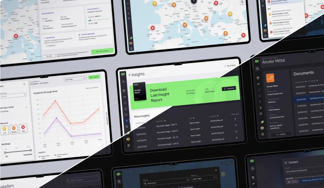
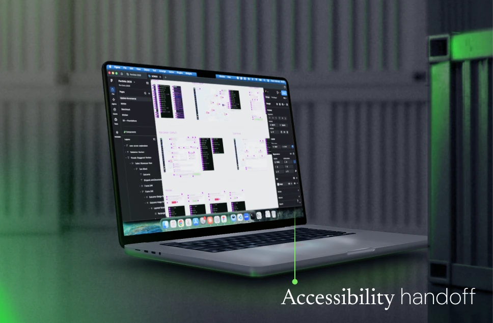
SCRIOO went live as a responsive web platform. Design system foundations, theme tokens and documented states supported implementation across light and dark modes.
- A simplified first layer on the map, with access to deeper detail preserved
- Incident Through Time, for comparing supplier risk across a period
- Flows, states and interaction rules documented for implementation
- A team that moved from internal debate to evidence-informed decisions



A Designer's Takeaway
This project reinforced an important lesson:
in complex products, the first design challenge isn't the screen. It's understanding what decision the interface needs to support.
Once that was clear, UI decisions became easier to explain, test, and document.



Let’s build better digital products.

hello@deiver.com.br